A well-designed public space in Bangalore!
by shreyakrishnan
About a year ago, I happened to buy a book called “The Design of Everyday Things” by Donald Norman for $1 at a garage sale in Brooklyn, and it serendipitously turned out to be one of the books that have most influenced how I view design until this point, not even excepting anything written about or by Steve Jobs. The basic premise of the book is that a well-designed object is one where the designer genuinely considers how humans interact with physical objects, and through this consideration, designs the object to do a few essential things: first, the object immediately communicates to the user the conceptual model of how it works through the design. So a door ought to communicate whether it should be opened by pushing, pulling or sliding. In other words, the conceptual model of how the door works should be evident in the design. Second, an object should provide feedback to the user. So for example, if you click on the x at the top left of a Windows OS program, the system immediately provides feedback, asking “do you want to save before you quit.” If there was no feedback at that point, that usually equals disaster. Third, the object should provide constraints that provide clues about how to use it. For example, data readers ought to be designed such that you can only insert a card one way and not the other. And finally, affordances: while it is possible for the floors of overbridges to be made of glass, it is generally not advisable because glass doesn’t denote the stability users expect of a bridge. DOET also emphasizes that the most important thing to focus on when designing an object that is user-friendly is to observe. When a user fumbles with an object, the first instinct ought to be assume that the object is badly designed and to observe exactly how the object is causing trouble for the user, not to assume that the user is stupid or slow, because well-designed objects are by definition idiot proof. Anyone can use them without any external guidance or help. It may seem impossible in some cases, but it really isn’t. Consider how Apple has made it possible for both my grandmother and my 1 year old niece to use an iPad without any tutorials.
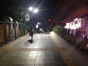
This was a long preamble, but now I’ll get to the point. Last week, I happened to walk to the MG road metro from Cunningham Road in Bangalore, and chanced upon *gasp* a well-designed public space in Bangalore! It’s the elevated pedestrian walkway leading up to the metro. The designers of this space thought about so many things that no one seems to have thought about in the myriad other public spaces I have seen thus far in Bangalore. Because I’m in the business of observing public space, and I can literally point to a bunch of things in the following photograph that I haven’t seen anywhere else in India, except maybe the Delhi Metro. So, here goes:
 1) The lighting! It’s well lit and feels safe and secure for a pedestrian. Note the single woman walking high above the street, in a situation where there are no “eyes on the street” (because it’s elevated and that you might think was isolating and scary but simply doesn’t feel that way!) There are other situations in Bangalore where elevated walkways have been a disaster and usually a site for muggings, but not here.
2)The tactile pavers! Finally, someone has thought about the visually impaired of their own accord. And they’ve even integrated it into the paving pattern so it doesn’t look like an aberration!
Oh, oh, and it ramps down, so it’s totally wheelchair accessible:
3) And then once it ramps down, it’s clearly demarcated from the street by the steel bollards so that two wheelers don’t get onto the pavement:
4) And also the stormwater culverts and the grating for the culverts are seamlessly (and aesthetically) integrated into the paving instead of the huge gaping holes underneath sidewalks that currently act as gratings where dogs and rats live, and into which BBMP employees sweep all the trash accumulated on the streets, so that all that plastic and other trash can get washed into a lake or whatever when it rains really hard. 
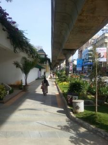
5) The cafe! Considering how I’m hemmed in on one side by the cafe and the other by a fence demarcating a park, this space just doesn’t feel scary or insecure. More amazingly, I’m not constantly afraid of being run over. In India, you have no idea how amazing this is!! Contrast this with what follows immediately afterwards:
Yes, that’s a sidewalk, and even though it’s a busy street with a wide pavement, I instinctively avoid walking on the pavement. I’d rather walk on the asphalt where I know I’ll be well-lit.
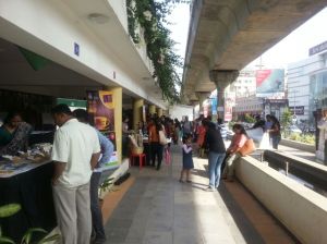
And during the day, (although I haven’t been, and I need to credit Rohit Tak with the following daytime shots), it looks like a vibrant public space under the flyover with plantings, public plazas and effectively programmed spaces so that it doesn’t become dead, scary space:
Apparently these spaces become sites for local street festivals and gatherings. The great thing about it is it isn’t overdesigned or rigidly programmed, so it can adapt to different circumstances, whether it’s a regular workday rush with street vendors, street musicians, or a coffee festival.
So how does this correlate with DOET? Well, for one, the conceptual model is pretty clear. It’s a space for pedestrians, and Metro users, not for cyclists or for motorcycles. This is something that other sidewalks in Bangalore simply do not communicate.. Perhaps the fact that it’s elevated has something to do with it. But then it’s all ramped, there are no stairs, so it would be relatively easy for a motorcycle to get on it. Yet none do. There certainly are constraints about what one can and can’t do: the sidewalk cafes, the public art, the tactile pavers, the bright lights all point towards constraints on other modes of traffic getting on the subway and unsafe/unsuitable behaviours on the elevated walkway. I didn’t once see a sign saying “No littering” or “No spitting” (unless I wasn’t observing that), and yet that didn’t seem to be a problem. The crucial thing about it is that the entire space works without communicating exactly how or why. In fact, I couldn’t even find the name of the design firm that did this space when I attempted to research this. It isn’t a visual sledgehammer like a lot of other developments. That’s why it’s a great example of everyday design.


That designers of good public spaces are not recognized is a pity. They should and all the more reason people like us should blog about then! Nice post, Shreya. Am reblogging this.
Reblogged this on ramblinginthecity and commented:
Well designed public spaces can significantly change our cities. This is a great post by an ex-colleague Shreya that analyzes a public space in Bangalore, pointing out positive elements of design.
Reblogged this on archiabyssniya.
Great post! Well designed sidewalks (or rather sidewalks) are a rarity in India. And the solutions are so simple that it seems silly to not incorporate such design features.